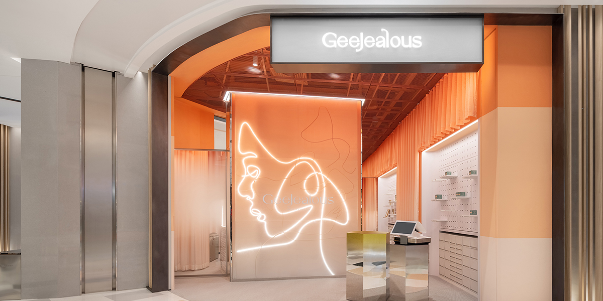
With “curves” as its core language, anySCALE developed a complete and highly unified visual identity system for GeeJealous—from logo and color palette to graphic elements and applications—establishing a clear and distinctive visual order.
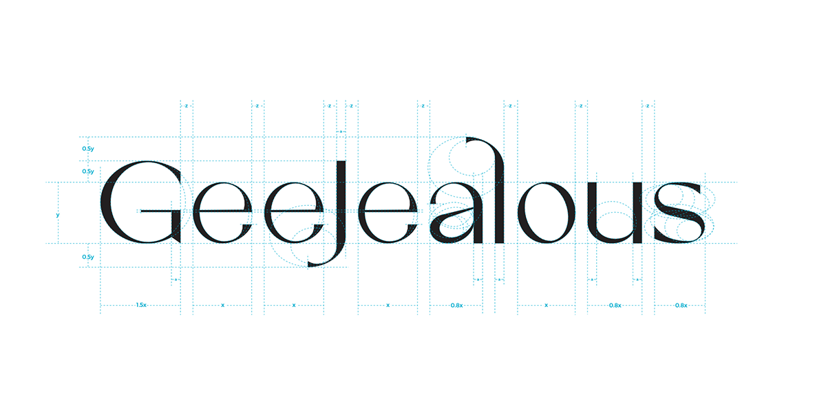
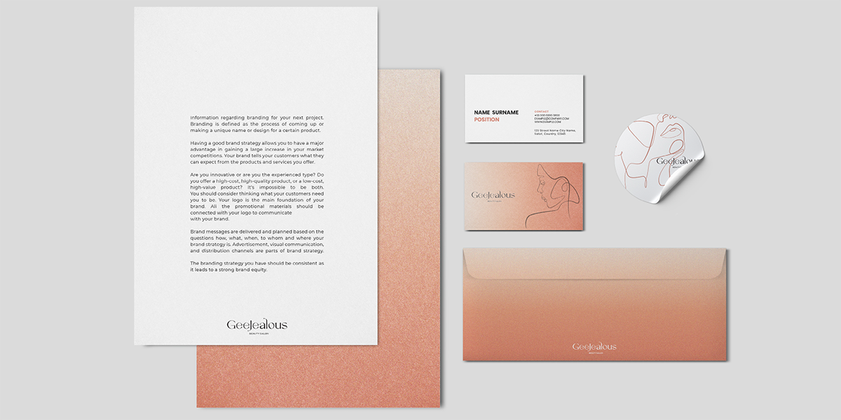
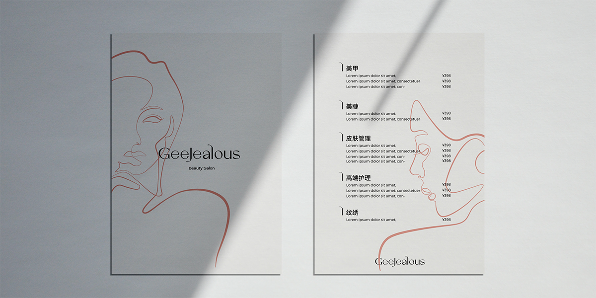
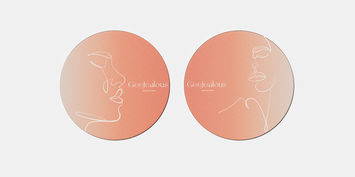
The GeeJealous logo is based on an elegant serif typeface, balancing softness and structure. Sculptural detailing at the terminals preserves fluid femininity within a rational framework. Inspired by refined urban women, the supporting graphic system features continuous-line female silhouettes. These flowing lines, like single-stroke sketches, reinforce the brand’s curved DNA.
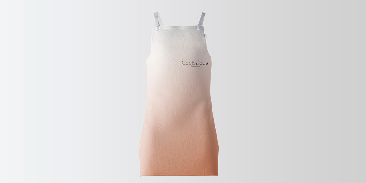
Deep coral red serves as the signature color—sweet with a subtle sense of allure. The brand palette adopts a warm coral gradient, transitioning from soft tones to saturated intensity. This shift is not merely visual but expressive of brand attitude, balancing gentleness and confidence, sweetness and strength. The gradient extends from spatial backgrounds to printed materials and communication, ensuring consistent recognition across touchpoints. Elegant lines and a classical undertone convey both desire and confidence.
Within anySCALE’s overall strategy, space and brand are not separate systems but integrated structures. Curves connect visual and architectural language, gradients set the emotional atmosphere, and linear graphics strengthen the symbolic expression of femininity.