Unlike traditional fitness narratives centered on strength, confrontation, or competition, MAX 12 shifts the focus to bodily change and sensation. The brand concept is inspired by the human body heat map, a visualization of physical activity through temperature variation. Here, movement is understood not as a fixed output of intensity, but as a continuously evolving process.
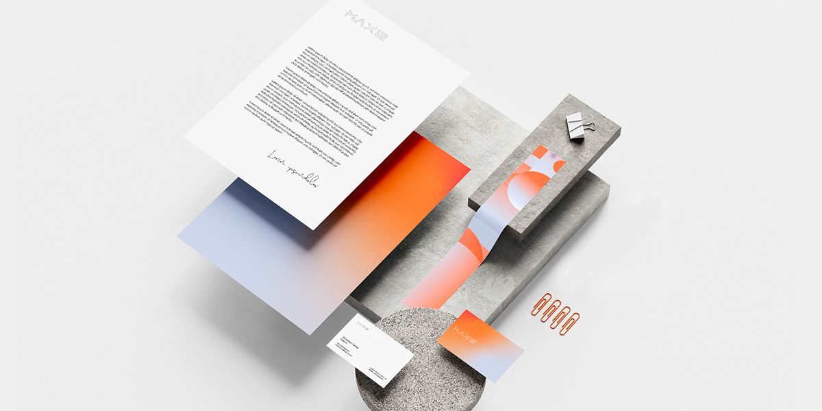
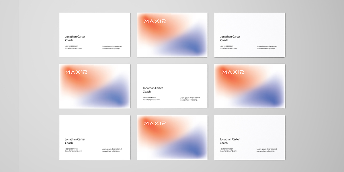
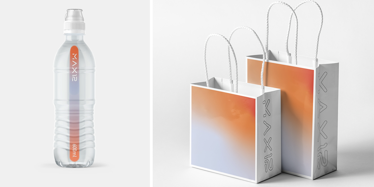
Based on this idea, the visual system adopts gradients as its core language. Deep warm tones represent energy release, muscle activation, and rising body temperature, while lighter cool tones correspond to stretching, recovery, and moments of calm, conveying balance, focus, and self-regulation. Following the “thermal gradient” principle, the design introduces clean, dynamic graphic elements, allowing the training process to be perceived as a continuous path that balances strength and flexibility.
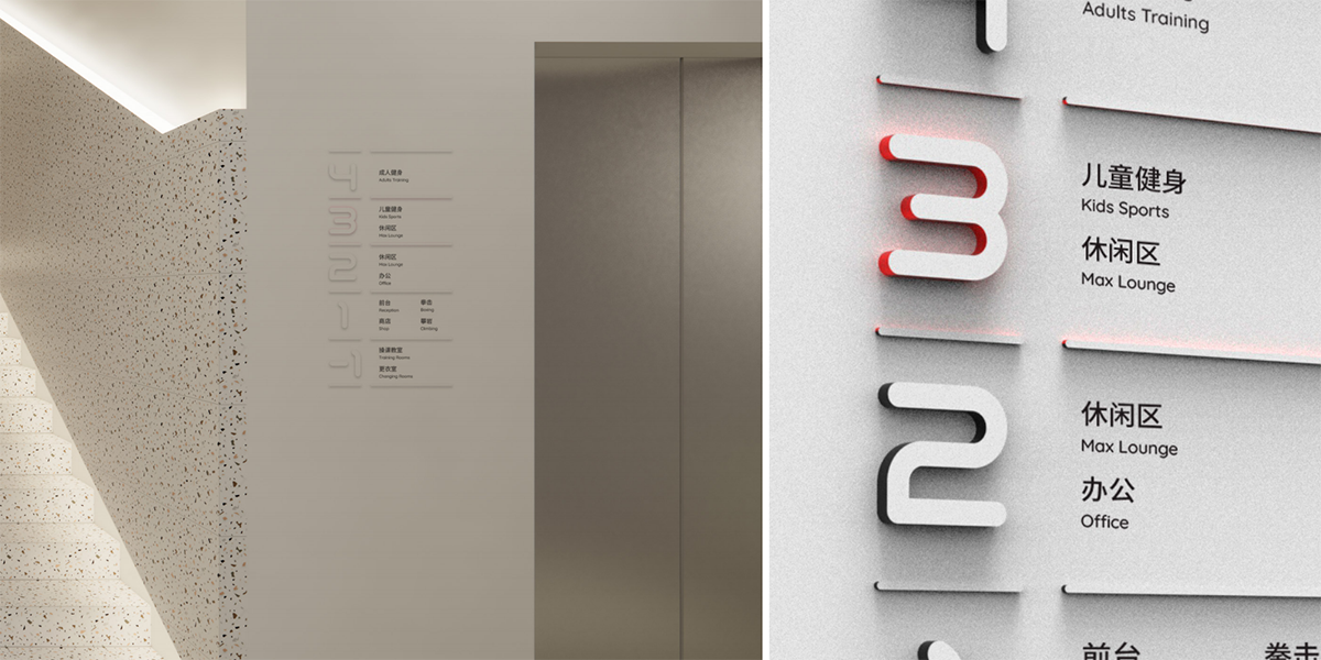
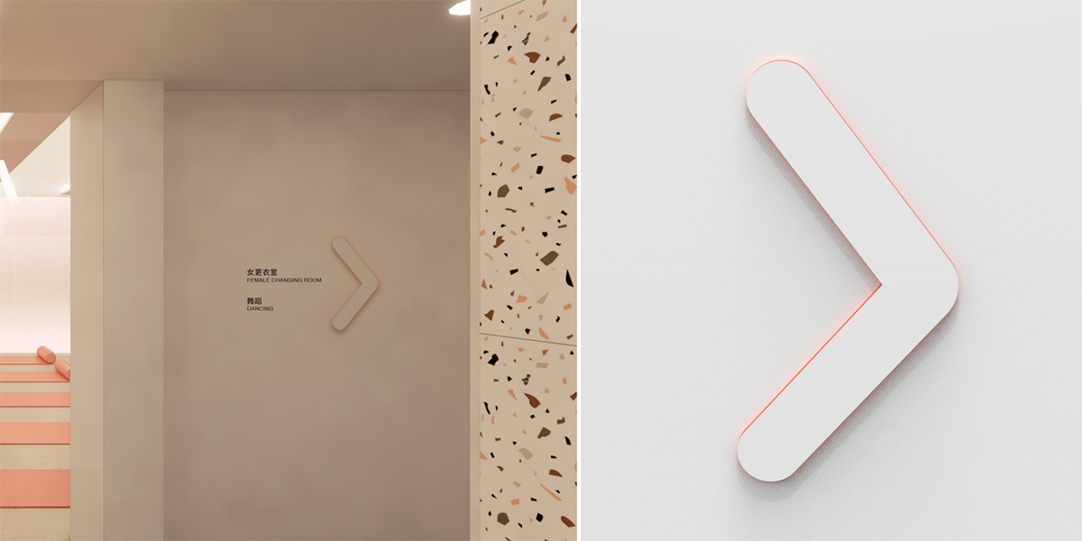
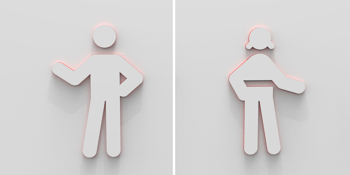
The wayfinding system maintains a rational typographic layout and aligns chromatically with both the space and the thermal gradient concept. Functional zones are indicated through gradient shifts or clear color markers, enabling intuitive spatial orientation through color change alone.
At MAX 12, movement, recovery, and emotional regulation are equally valued. Training is no longer about pushing harder, but about understanding and respecting the body’s condition in every session.